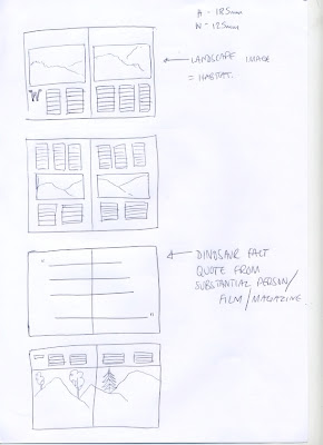
I took the designs to the computer, using stock photography instead of illustration to adhere to the more adult audience rather than a 'cheaper' children's book. I want to create a feel of tradition and almost fairy tale, this will make the books more fun and interesting, as well as being informing and design savvy.
Here are initial layouts for certain pages
Wednesday 31 March 2010
Natural History Museum
Monday 29 March 2010
Natural History Museum
Natural History Museum
I have returned to a brief I set aside. The brief has changed slightly, I now plan to create a series of info-books for sale under the Natural Science Museum brand name.
Here is the first response, a collaboration with Lucy Hawkins, using her hand-drawn illustration skills. However, I feel the outcome is not my own as the illustrations are the main focal point and in a way my input is not needed, therefore I plan to alter the style of the books, using more of an info-graphic approach to enable me to apply more experimental layout, type and image of my own.
Friday 26 March 2010
Yearbook
After a meeting with course tutors, we had quick one-to-ones with students to go over initial ideas they may have for their image which will reflect their personalities and design practice.
Here are a few ideas we put down:
Olivia Greaves
Liv's music, illustration and influence are combined.
Karl Cartwright
Karl's editing skills and photography are reflected in his idea.
Yearbook
Film Festival - D&AD
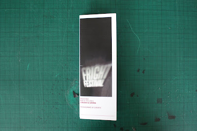
I have started to design the other outcomes of the project, here are ideas and prototypes of the posters, which will advertise the film festival. I want to keep the silhouette images as a running theme throughout the media of the film festival.
The format of the poster relates back to the 1930s era of horror films, the classic banner style poster. Also the increased visual height of the poster adds to the scary, overcoming fright which is evident in other outcomes such as the programme.
The format of the poster relates back to the 1930s era of horror films, the classic banner style poster. Also the increased visual height of the poster adds to the scary, overcoming fright which is evident in other outcomes such as the programme.
Film Festival - D&AD
Film Festival - D&AD
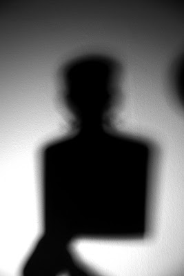
I have used the horror star stencils. photographic them with a spotlight against a white wall.
Then edited them, by turning the images to B+W and adjusting levels and contrast in Photoshop.
The images work well, they create the scary, classic horror feel I was aiming for. However, I plan to re-shoot the images to gain a cleaner silhouette of the stencil.
Then edited them, by turning the images to B+W and adjusting levels and contrast in Photoshop.
The images work well, they create the scary, classic horror feel I was aiming for. However, I plan to re-shoot the images to gain a cleaner silhouette of the stencil.
Monday 22 March 2010
Yearbook
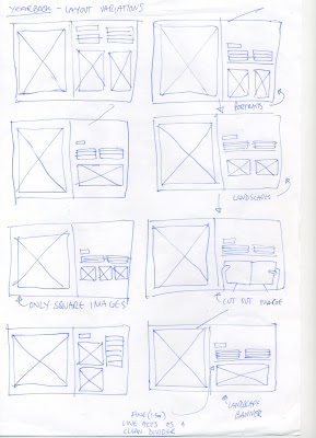
I have been working on the amends for the yearbook.
Here are ideas for the time concept, and new layout tests.

The problem lies in the second page of each student's DPS, as fitting two or more different format images together, and still looking good is quite hard. The pages must be adaptable to hold portrait, landscape and cut-out images, I feel the text needs to remain in the exact same place on every page as to nit interrupt the flow of the book.
Here are ideas for the time concept, and new layout tests.

The problem lies in the second page of each student's DPS, as fitting two or more different format images together, and still looking good is quite hard. The pages must be adaptable to hold portrait, landscape and cut-out images, I feel the text needs to remain in the exact same place on every page as to nit interrupt the flow of the book.
Subscribe to:
Posts (Atom)
