Here is a mock-up of the popcorn box I am including in the printed outcomes for the project.
Its very simple and using only paper construction I think it can be assembled easily by the public as I plan to use the box as an invite which would be mailed to people, giving them not only a ticket for the event but also an empty popcorn box for them to fill when they arrive.
Monday, 17 May 2010
Film Festival - Map
I have taken a map from an existing Hyde Park Picture House Programme and re-used it for my programme. I feel the map is an essential addition for the programme as the location of the Picture House is quite complicated to find through text-only directions.
Yearbook
Film Festival - Branding
Film Festival Programme
I have changed the body text to a serif typeface; Minion Pro. I feel DIN as body text is not relative enough for the subject, and a more classic/traditional typeface like Minion Pro adds to this style I am aiming for the event.
Here is a printed version, I chose to use an off-white cartridge to keep in with the off-white posters and other outcomes. This again adds to the traditional/aged style relating back to the early 20th century when black and white cinema was groundbreaking and used off-white, rough paper for poster promotion.
(image of programme digital spread)
(image of programe)
Film Festival Programme
I have translated the new design style from the poster across to the programme. Using the film strip scenes to add a real insight into the subject of black and white horror cinema.
I have used a 12 column grid to keep the layout of type and image as clean and consistent as possible, more interesting techniques such as the type overlaying image for each film title is also apparent to break the grid and be more original in design.
I have used a 12 column grid to keep the layout of type and image as clean and consistent as possible, more interesting techniques such as the type overlaying image for each film title is also apparent to break the grid and be more original in design.
Monday, 10 May 2010
Film Festival - POSTER
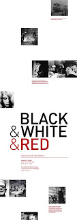
I have used the red overlay on this layout, unsure if it possibly draws attention away from the title and derives it from the focus on black and white cinema...as the images are red, not black and white. Also splitting the text into bite-size chunks makes the poster fill out more, and easier to take in when viewed up close, leading the viewer right across the entire poster to read info.
Film Festival - POSTER
Here are even further amends, to keep in with the 'random' or scattered layout of imagery on the poster I have included the body of text to move with the images. This keeps the style of layout consistent and also adds life to the chunk of text, which could look unconsidered if it sat with the title.
Film Festival - POSTER
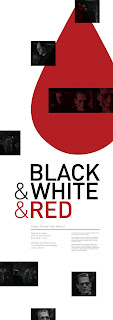
here are further amends to the poster design, I plan to red foil the blood drips onto the poster as a subtle but detailed addition to further entice the viewer to not only notice the poster from afar due to the large, bold type, but also view the poster up close with the foil finish and smaller text info.
Saturday, 8 May 2010
Film Festival - Direct Mail
To extend the film festival brief, I plan to create a direct mailer to send to invitees of the festival. The renown popcorn box was a product I intended to produce anyway for the brief, but making it operate as an invite/promo piece as well improves its versatility and inclusion to the outcomes I produce.
(image of work sheet)
Yearbook - Layout
I have been experimenting with the layouts of the yearbook, we (the yearbook team) feel that the book is fine and works as a standard yearbook, but it doesn't stand out enough and the design is somewhat repetitive.
Here are some more experimental designs,
Here are some more experimental designs,
Natural History Museum - Outcomes
Subscribe to:
Posts (Atom)


