I have adapted the invite and popcorn holder into one format, however, the necessary perforations to enable users to easily fold the popcorn holder will disrupt the text on the invite and make the entire piece look messy and not to the high quality standard the rest of the film festival's promotional material is.

Showing posts with label Horror Fest. Show all posts
Friday, 4 June 2010
Film Festival - amends to invitation/direct mailer
I have adapted the invite and popcorn holder into one format, however, the necessary perforations to enable users to easily fold the popcorn holder will disrupt the text on the invite and make the entire piece look messy and not to the high quality standard the rest of the film festival's promotional material is.
Horror Film Festival Development
When printing the programme with the use of overlayed type onto the black and whote image, I encountered a problem; you cant read the type. Therefore I have altered the brightness on the images and positioned the type on the white parts of the image to avoid losing any information in the black. Also, designs for the 'Golden Stakes' awards, use of plaque cards are a form of medal, given to a range of winning themes such as best actor, best death, scariest moment and most iconic horror villain.
Monday, 17 May 2010
Film Festival - Popcorn
Here is a mock-up of the popcorn box I am including in the printed outcomes for the project.
Its very simple and using only paper construction I think it can be assembled easily by the public as I plan to use the box as an invite which would be mailed to people, giving them not only a ticket for the event but also an empty popcorn box for them to fill when they arrive.
Film Festival - Map
I have taken a map from an existing Hyde Park Picture House Programme and re-used it for my programme. I feel the map is an essential addition for the programme as the location of the Picture House is quite complicated to find through text-only directions.
Film Festival - Branding
Film Festival Programme
I have changed the body text to a serif typeface; Minion Pro. I feel DIN as body text is not relative enough for the subject, and a more classic/traditional typeface like Minion Pro adds to this style I am aiming for the event.
Here is a printed version, I chose to use an off-white cartridge to keep in with the off-white posters and other outcomes. This again adds to the traditional/aged style relating back to the early 20th century when black and white cinema was groundbreaking and used off-white, rough paper for poster promotion.
(image of programme digital spread)
(image of programe)
Film Festival Programme
I have translated the new design style from the poster across to the programme. Using the film strip scenes to add a real insight into the subject of black and white horror cinema.
I have used a 12 column grid to keep the layout of type and image as clean and consistent as possible, more interesting techniques such as the type overlaying image for each film title is also apparent to break the grid and be more original in design.
Monday, 10 May 2010
Film Festival - POSTER
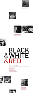
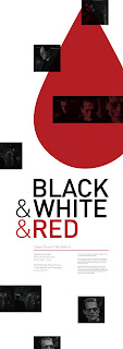
I have used the red overlay on this layout, unsure if it possibly draws attention away from the title and derives it from the focus on black and white cinema...as the images are red, not black and white. Also splitting the text into bite-size chunks makes the poster fill out more, and easier to take in when viewed up close, leading the viewer right across the entire poster to read info.
Film Festival - POSTER
Here are even further amends, to keep in with the 'random' or scattered layout of imagery on the poster I have included the body of text to move with the images. This keeps the style of layout consistent and also adds life to the chunk of text, which could look unconsidered if it sat with the title.
Film Festival - POSTER
here are further amends to the poster design, I plan to red foil the blood drips onto the poster as a subtle but detailed addition to further entice the viewer to not only notice the poster from afar due to the large, bold type, but also view the poster up close with the foil finish and smaller text info.
Saturday, 8 May 2010
Film Festival - POSTER
here are a number of digital poster designs, I have used screen shots from classic horror films as a form of basic imagery, which isn't too over powering which would detract from the title, but also relative as its of a classic horror film (Frankenstein).
Working from my sketches by arranging the screen shot imagery around the info, I find the use of type overlaying the image works best as white space becomes less dominative on the page.
Film Festival - POSTER
Here are initial ideas for the poster layout for the promotional material for the film festival.
The posters will be large and narrow, and use minimal colour and finishes to replicate classic, old film posters.
(image of a1 poster sketch)
Sunday, 2 May 2010
Subscribe to:
Posts (Atom)