Over the fmp I have progressed as a designer greatly, I feel more able to design, having more confidence in what I do, making decisions at ease, but most of all I feel more experienced, and this is something which I feel will help me to continue to progress and ready me for my career in design after the course.
I feel I have managed my time over the fmp well, i have achieved a lot in terms of design and finally discovered what I want to do in design. During the fmp, I feel I have become more independent as a designer, by frequently taking a leading role during the yearbook brief. I have more confidence when showing and talking about my work as I know its to an expected standard in the industry, again this is something I feel the course has helped me with as some institutions don't offer this kind of help and it shows. Also, I have improved the pace of my design, I can now pick up a brief and finalise it to a short deadline by making confident decisions, I feel this is something vital to be able to do as the industry is at a fast pace and having this experience of it whilst on the course has prepared me for work, where it really counts.
I value the course greatly as I now feel prepared to start working in the real world, an opportunity I feel the course has provided me with through the experience to show my work to visiting professionals, do work placements and create a number of contacts.
I can't wait to start designing at a professional level, in a devoted design studio, with passionate designers again.
Friday 4 June 2010
Yearbook Print Spec

Here is the print spec for the yearbook, the final spec has altered since, now a proposed 120gsm stock in side and 350gsm cover, to give the book more durability over time.
Volunteer - final publication


Here are images of the final publication(s) of the volunteer brief. Also stickers using the 'do' logo are to be worn by volunteers as a mark of achievement. The publications are printed on bulky newsprint (off white paper) to give the publication its low-cost finish but to also represent the imagery at a high standard as ink sits well on this stock and does not crack when folded.
Volunteer - final cover


here is the final cover stock/colour for the publication. Like the other colour tests, it stands out much more than the initial white stock, making the bold identity sit with a bold publication. Yellow/mango is also a positive colour, it represents sunshine and all things good, therefore continuing to deliver the positive message which is the focus of the content.


Volunteer - Cover amends


The cover has been amended to allow the brochures to sit inside with ease and not break and cover info on a fold. This was made possible by narrowing the quote to free more space for the fold. Also, the thank you list has been amended to title case as capitals are somewhat harsh and not as friendly as title case.
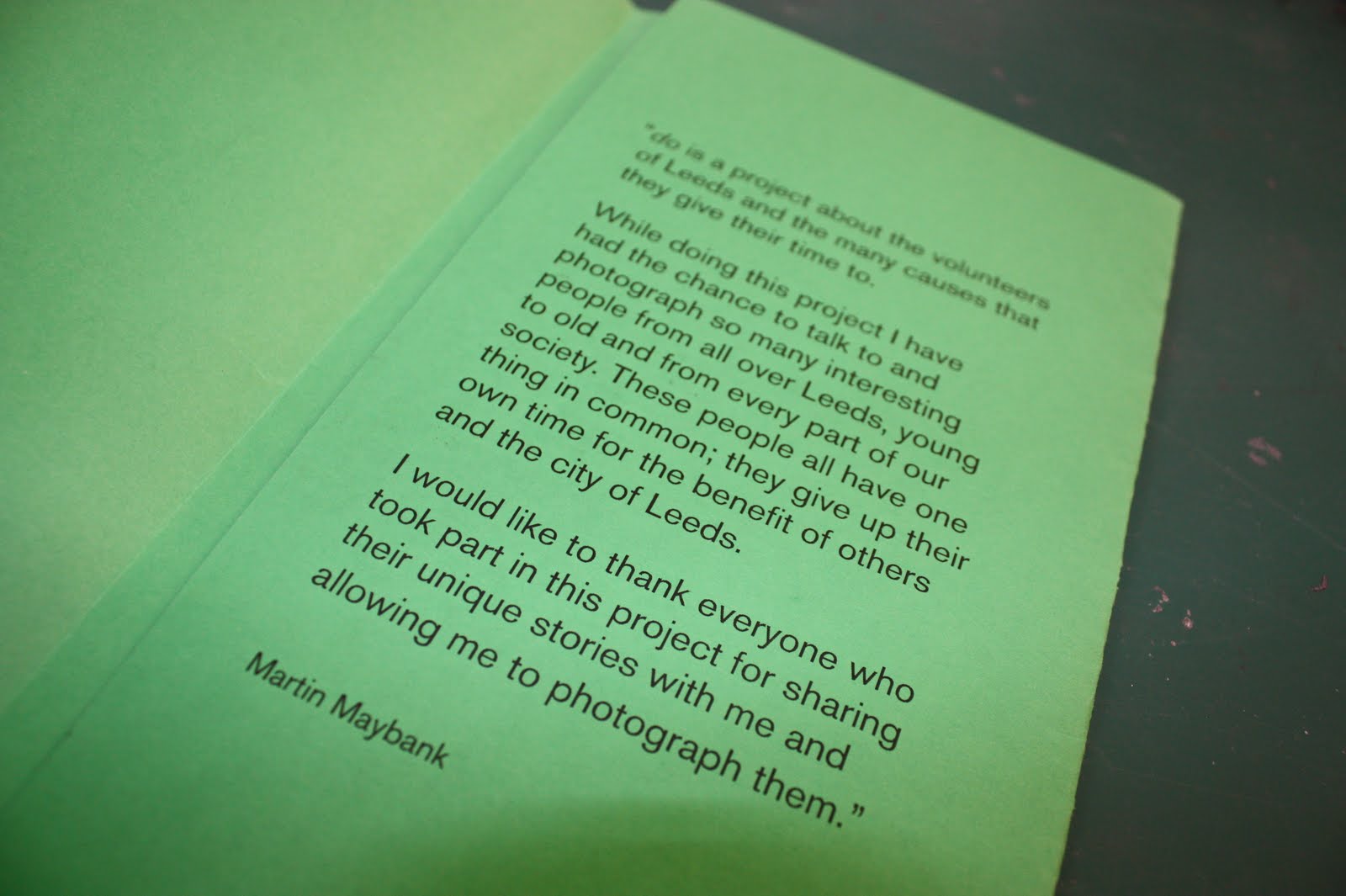
do - amends to publication sleeve


Additional information has been added to the cover, I feel an introduction by Martin is needed to explain what the publication is all about, and as it is his research/documenting project, he is the best person to introduce it. The intro will be the first thing the reader encounters when opening the cover of the publication.
Subscribe to:
Posts (Atom)
