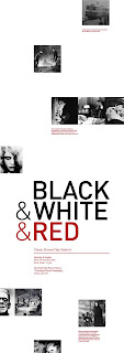
I have used the red overlay on this layout, unsure if it possibly draws attention away from the title and derives it from the focus on black and white cinema...as the images are red, not black and white. Also splitting the text into bite-size chunks makes the poster fill out more, and easier to take in when viewed up close, leading the viewer right across the entire poster to read info.
Monday, 10 May 2010
Subscribe to:
Post Comments (Atom)


No comments:
Post a Comment