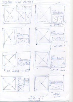
Here are ideas for the time concept, and new layout tests.

The problem lies in the second page of each student's DPS, as fitting two or more different format images together, and still looking good is quite hard. The pages must be adaptable to hold portrait, landscape and cut-out images, I feel the text needs to remain in the exact same place on every page as to nit interrupt the flow of the book.


No comments:
Post a Comment