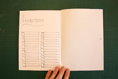
Here are designs, developments and prototypes of the brochure, exploring different sizes and stocks.
A5 Single-fold. This format does not have the space for the amount of copy/info to allow me to create a visually appealing brochure, the space will be crammed with copy and just too much to take in.

A6 hot-dog fold. This brochure is tiny, this is appealing to me as it stands-out from others and is easily picked up and kept in pockets, giving it an ease of use advantage. However, similar to the prototype above, size is an issue, the amount of copy will be a struggle to fit this A6 brochure. The hot-dog fold appeals to me, I think the fold offers something different in the brochure 'world', it forces the user to interact with the brochure more, enabling them to operate it as a book, turning the pages (or in this case doors).
The Hot-Dog Fold is apparent in this prototype, using a slightly larger size, A5 and folding-out into an A2 size poster. This is a much more effective size as the copy can be arranged with ease without the danger of over-crowding a page. I have arranged the copy on this prototype, the cover will hold the name and vital info such as the location and date, opening up to a brief intro of the show, turning a door (subtle use of the opening doors concept) to the list of exhibitors, turning a door to the map (which lays on the reverse of the folded brochure for quick/easy viewing, opening up to further details of travelling to the show, and then finally opening up to the full poster which imitates the front cover of the brochure.


No comments:
Post a Comment