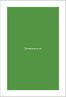
After initially designing the cover to hold an illustration, I feel this will confuse the book and become a mis-mash of illustration, photography and type. Therefore I have decided to keep the cover clear, bold and branded. here are a few initial layouts and colour-ways I think will work.
Saturday, 17 April 2010
Natural History Museum
Cover design.
After initially designing the cover to hold an illustration, I feel this will confuse the book and become a mis-mash of illustration, photography and type. Therefore I have decided to keep the cover clear, bold and branded. here are a few initial layouts and colour-ways I think will work.
After initially designing the cover to hold an illustration, I feel this will confuse the book and become a mis-mash of illustration, photography and type. Therefore I have decided to keep the cover clear, bold and branded. here are a few initial layouts and colour-ways I think will work.
Subscribe to:
Post Comments (Atom)


No comments:
Post a Comment