For the book cover of the small dinosaur info-books, I have amended the colour to a more prominent green, as the cartridge stock makes the colour sink to a darker green. I have also tested the use of adding each book cover to the back page of the book, showing the other books in the series to collect, however I feel this is unnecessary and just does not look clean enough to fit with the rest of the book.
Friday, 30 April 2010
Thursday, 29 April 2010
Tivoli Audio Challenge
Picked up a new competition brief for Tivoli Audio, the basic outline of the brief is to create a promo poster/billboard to promote Tivoli and its 10th anniversary. I plan to extend this outcome and possibly produce a brand pack as that is an outcome I have not considered throughout my fmp. Also, the brief is very brand/identity orientated, this is an area I very much want to focus on in my design practice.
http://www.tivoliaudio.com/promo_10th-anniversary-global-design-challenge.php
http://www.tivoliaudio.com/promo_10th-anniversary-global-design-challenge.php
Yearbook - Achievements
For the achievements section of the yearbook we have decided to use some of the outtake shots as they give a more friendly and personal view of the student, but also to avoid repeating the same image and thus making the book repetitive.
Natural History Museum - Extending range
Here are more designs to extend the range of products for the brief.
Using the same style of just type and fact, but relative to the product it is on, keeps the range linked.
Mug:
Pen:
Ruler:
Using the same style of just type and fact, but relative to the product it is on, keeps the range linked.
Mug:
Pen:
Ruler:
Film Festival - Stock
I have purchased a range of stocks for the outcomes of the film festival project. The ticket/invite, programme, flyers and posters will be printed on this range of similar stock. The stock is off-white, almost parchment-like, giving the film festival the classic aesthetic. I will print the ticket/invite on the satin coated stock (bottom right) to add an extra high value and importance/exclusivity as it is an important piece to get into the festival. Also the red foiling will further this importance/exclusivity.
Natural History Museum - Tote Bags
To further extend the range of products for the brief, I plan to print tote bags, each bag will hold a fact about dinosaurs which is relative to the product it is on.
Here is a mock-up digital version, I will screen print/ iron transfer the bags for submission however.
The canvas and green bags allow me to continue the brand identity, using green or white type, the black bag may stand out from the range of products as black is not very frequent throughout.
Here is a mock-up digital version, I will screen print/ iron transfer the bags for submission however.
The canvas and green bags allow me to continue the brand identity, using green or white type, the black bag may stand out from the range of products as black is not very frequent throughout.
Natural History Museum - Book
Here is a mock-up of the dinosaur book, I have printed on cartridge paper to give the book a more quality and considered feel, rather than a cheep/nasty gloss. Also I have stitch bound the book, I think this vastly improves the appearance of not only the book itself but the identity of the dinosaur range. In terms of print/binding prices however, such a small book to be stitched is hard, usually stitched books work in sections of 30 pages or so which come together as a set to form the book, as my book is a total of 30 pages it is only one section and would need an additional 90 pages or so to be professionally stitch bound.
Natural History Museum - Notepad
I have applied the dinosaur range identity to the notepad, filling the cover with green so it really stands out.
I am glueing the notepad at the top to enable the pages to open out almost flat..however I feel a more hand-crafted binding such as stitch could really appeal to the museum audience, adding quality of craft to the products.
I am glueing the notepad at the top to enable the pages to open out almost flat..however I feel a more hand-crafted binding such as stitch could really appeal to the museum audience, adding quality of craft to the products.
Yearbook - Feedback
After yesterdays pitch we received some feedback on the yearbook. The suggestions were very valid and particularly helpful for our cover design, an area which has been almost avoided until now.
The inclusion of the number 2 should be integrated into the cover, this could be the use of the character 2, two shapes or lines etc, or another way to add the two such as the inclusion of a photograph of a set with the number 2 in it, or a particular print finish to make 2 parts of the cover differentiate from the rest.

Looking at the previous yearbook I feel the number 2 could be added more conceptually rather than a big 2 printed. The spine needs to remain the same however, this is a point to allow for when designing the cover.
Mine and Rhianne's initial cover designs related more to the layout of the content of the book; repeating the black square where the images lie inside to create a 'blank canvas' which is repeatedly filled inside of the book. We thought of perhaps including a spot colour in the large black block to really make the cover stand out.

Our proposed use of a narrow cover jacket would be a nice format-based touch to the book but would really blow the budget as it would be a separate print job, and as the budget is already tight as it is, a different approach is required.
The inclusion of the number 2 should be integrated into the cover, this could be the use of the character 2, two shapes or lines etc, or another way to add the two such as the inclusion of a photograph of a set with the number 2 in it, or a particular print finish to make 2 parts of the cover differentiate from the rest.

Looking at the previous yearbook I feel the number 2 could be added more conceptually rather than a big 2 printed. The spine needs to remain the same however, this is a point to allow for when designing the cover.
Mine and Rhianne's initial cover designs related more to the layout of the content of the book; repeating the black square where the images lie inside to create a 'blank canvas' which is repeatedly filled inside of the book. We thought of perhaps including a spot colour in the large black block to really make the cover stand out.

Our proposed use of a narrow cover jacket would be a nice format-based touch to the book but would really blow the budget as it would be a separate print job, and as the budget is already tight as it is, a different approach is required.
Natural History Museum - Badge Packaging
As I am currently waiting for the button badges to be created and delivered, I have created the packaging to hold them. Here is the top tab and backing card which the badges will be pinned onto. All will be concealed in a cellophane bag. The strong green on off-white and use of the script typeface, gives the entire dinosaur range a real identity, I plan to extend this identity across the range of products.
Natural History Museum
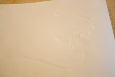
I have been experimenting with stocks and processes for the cover of the dinosaur books. I have tried some embossing, using a t-rex head stencil to press through the paper, this enables me to have the dinosaur on the over of the book but is subtle enough not to confuse the use of photography throughout contents of the book.

The embossing is fairly successful, some detail is lost especially around the teeth.. However I may well encounter problems when creating the embossing for other dinosaurs due to their much simpler heads, the embossed image would look so abstract it would be hard to tell what it actually is.

The embossing is fairly successful, some detail is lost especially around the teeth.. However I may well encounter problems when creating the embossing for other dinosaurs due to their much simpler heads, the embossed image would look so abstract it would be hard to tell what it actually is.
Natural History Museum
Dinosaur badges,
I have started to extend the range of outcomes for the project, as my aim is to produce material to be sold in the museum shop and online store.
Here are designs for button badges, a small and cheap product to make, they make a great addition to my range of dinosaur fact media. As the buttons are so small, the design needs to be simple, I have used the actual meanings of the dinosaur names.
Tyrannosaurus rex; 'Tyrant Lizard'
Brachiosaurus; 'Arm Lizard'
Velociraptor; 'Speedy Thief'
Film Festival
I have been designing the film festival ticket with the amended logo, I want to keep in with the running portrait format throughout the project, I plan to red-foil the blood drip to add to the more valuable quality of the flyer and this will reflect on the even itself, as the festival celebrates the classic horror films rather than current blockbusters.
Below is the final ticket design, I have aligned the texts with the logo, but allowing the '&' characters to sit outside of the alignment, emphasizing the logos modern take on horror. To contrast the sans serif logo, I have used a serif typeface for the copy, Georgia helps to add quality and class to the flyer and sits nicely against sans serif DIN. The 30% opacity on the intro 'You are invited', allows the reader to notice the logo first but the intro makes the flyer more personal and friendly, effectively welcoming the reader into the flyer.
Below is the final ticket design, I have aligned the texts with the logo, but allowing the '&' characters to sit outside of the alignment, emphasizing the logos modern take on horror. To contrast the sans serif logo, I have used a serif typeface for the copy, Georgia helps to add quality and class to the flyer and sits nicely against sans serif DIN. The 30% opacity on the intro 'You are invited', allows the reader to notice the logo first but the intro makes the flyer more personal and friendly, effectively welcoming the reader into the flyer.

Subscribe to:
Comments (Atom)


